Logo Design

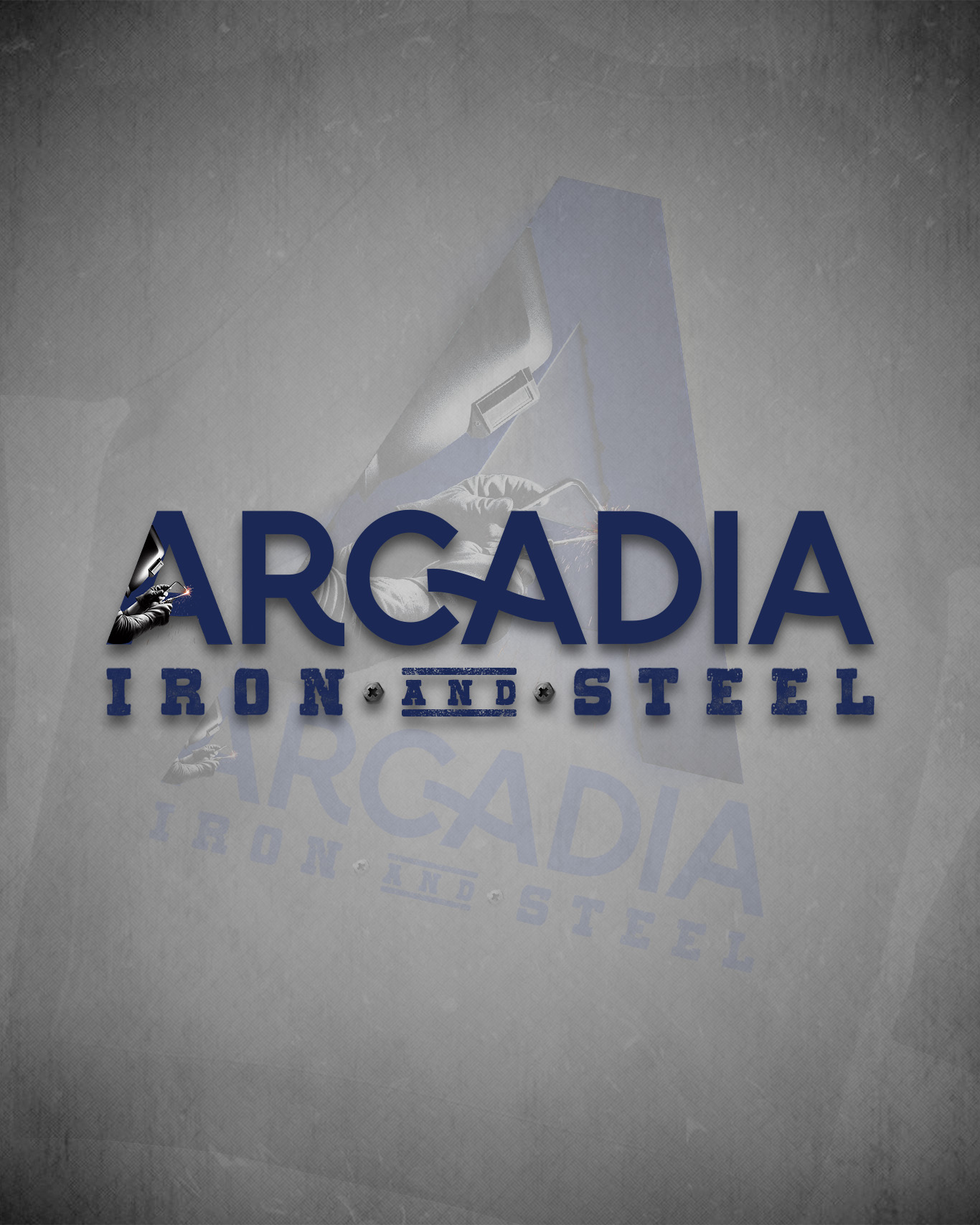
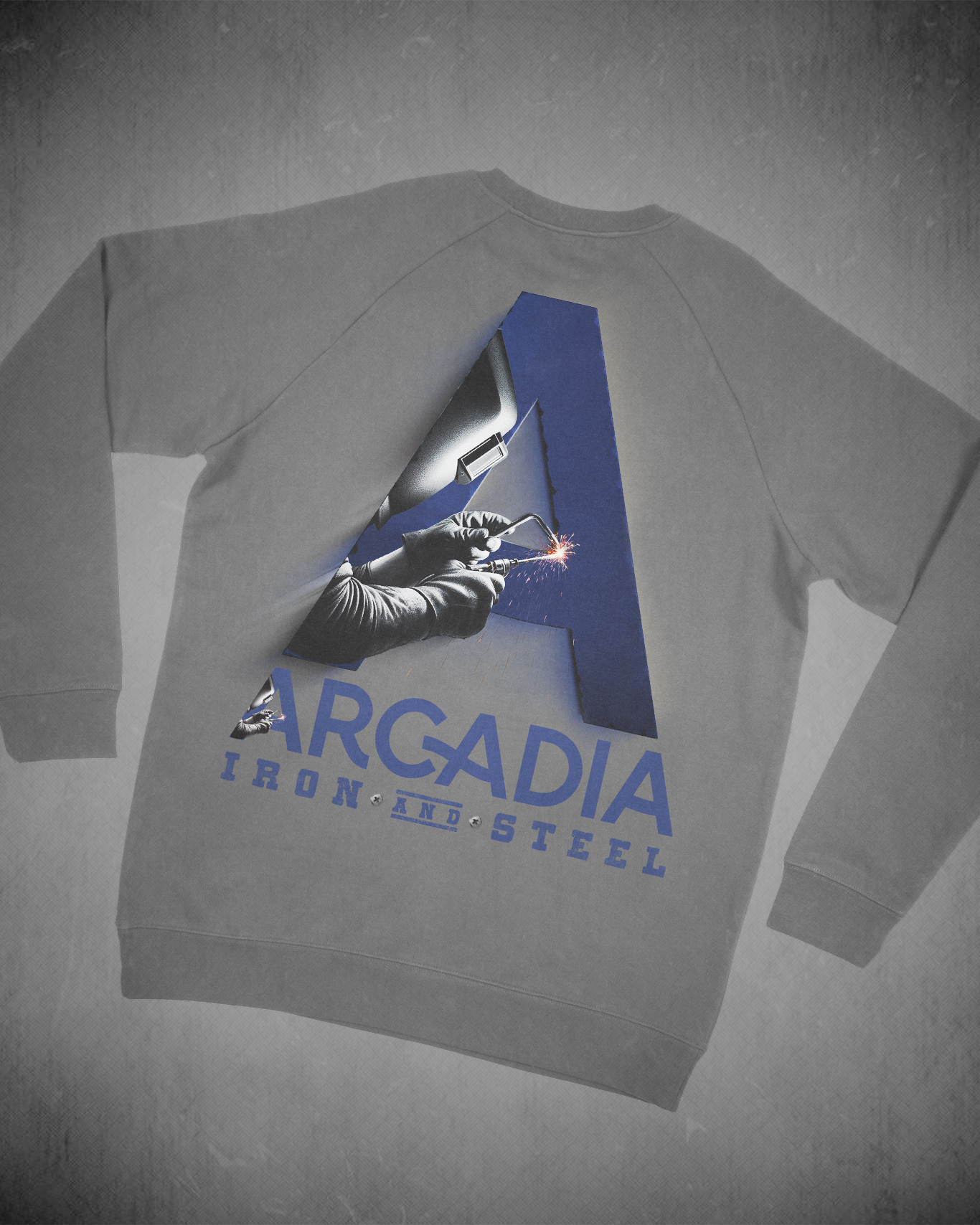
I design brands that mean something — identities built around who a business actually is, not just what looks good on a screen. For Arcadia Iron & Steel, that meant taking the grit and precision of metalwork and turning it into something you’d proudly wear. The centerpiece is the “A” lettermark — a bold geometric form with a welding action shot living inside it, because the craft is the brand. Every element earns its place.

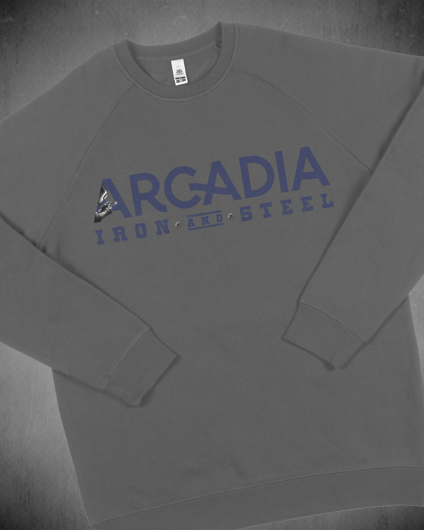
I keep things minimal so the message hits harder. Clean typography, a tight color palette, intentional photography — no noise, no filler. When it all comes together on something tangible like a crewneck, you know the brand is working. That’s what I build for small businesses: identities that look established from day one and actually hold up in the real world.

Client Name

Arcadia Iron and Steel

Project Types

Logo Design

I Offer...

  • Your story, made visual
  • Minimal, not generic
  • Built to scale
  • Small business focused
  • Details that do the work
Arcadia Iron and Steel