Shear Impressions Logo Design

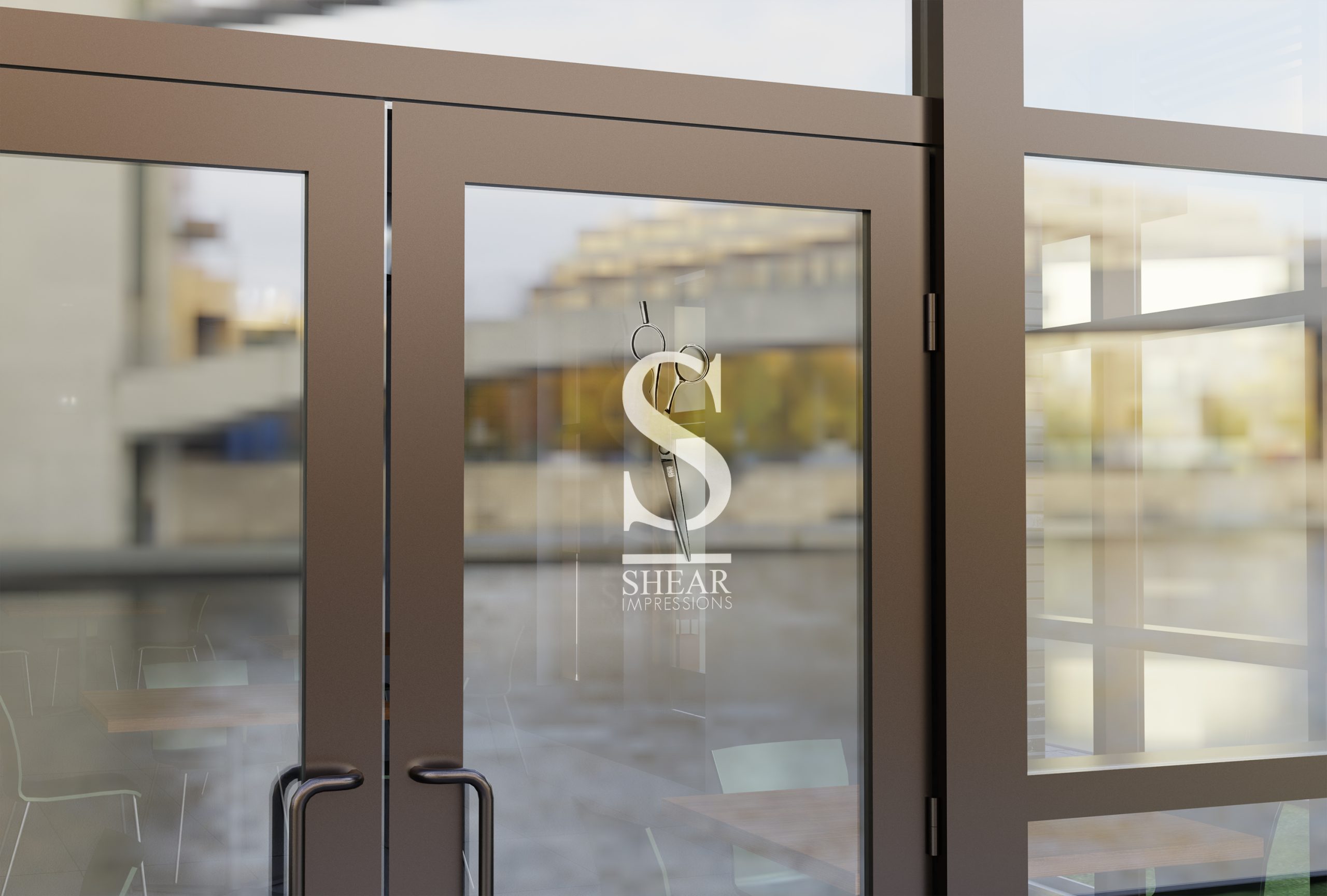
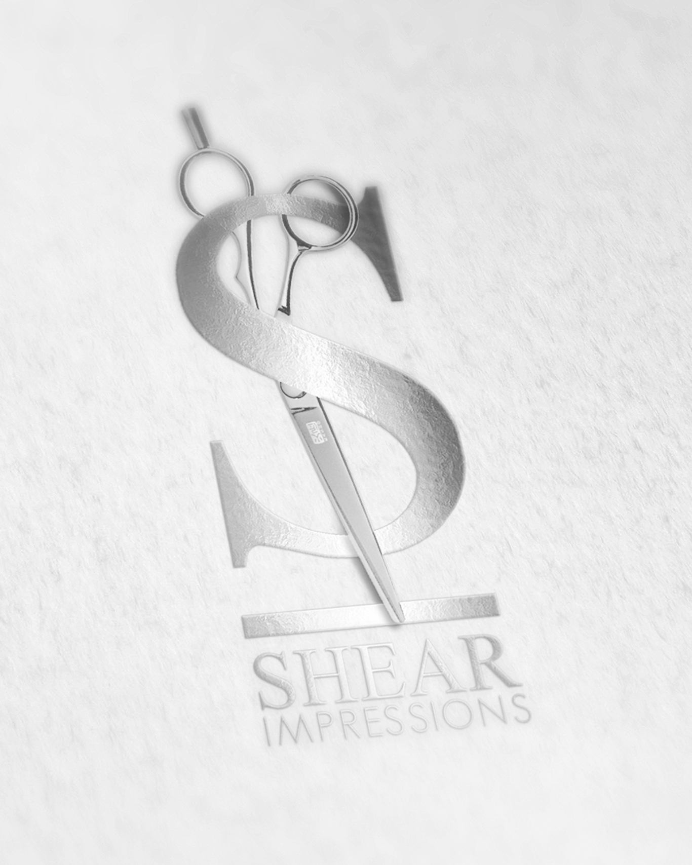
This one was about making a concept feel inevitable. For Shear Impressions, the idea was right there in the name — so I built the entire identity around it. The “SI” monogram does double duty: the bold silver S anchors the mark while a pair of shears runs straight through it, blade and all, turning the letterform into the concept. It’s the kind of logo where once you see it, you can’t unsee it. That’s the goal.

The execution is kept intentionally refined — metallic, embossed, tonal. No color fighting for attention, just form and craft. For a salon brand, that elegance signals quality before a single word is read. Small businesses in the beauty space need to compete with bigger names right out of the gate, and a logo like this puts them there immediately.

Client Name

Shear Impressions

Project Types

Logo Design

I Offer...

  • Concept-first thinking
  • Elegant, not overcomplicated
  • Industry-aware
  • Monogram & wordmark together
  • First impressions that stick
Shear Impressions Logo